

ca-visuals
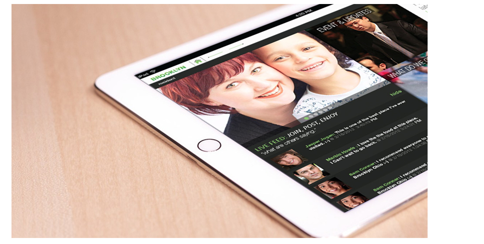
This app is design for user to get information and events about Brooklyn Ohio. By incorporating residents, busniess, and government information people from Brooklyn can easily navigate to information they desire.

Clean, slick, and sharp are key design elements use to compose the visual aesthetic look and feel of this tablet app. This design is built to create a user friendly interface that can guide one to his or her respective information.


After surveys and paper user testing, I was able to edit the wireframes to cater to user expected outcome and input. This image depicts the calender interface and interaction when an date is selected.


The point of this project was to redesign an current existing city app to make it more user friendly and perform the various tasks it was design to handle. I was led to this final outcome based on user feed back and interaction. Colors and other aesthetic were chosen because of trending elements of web design.

Design to show a particular use case, this video guide the veiwer on how to add an event to his/her calender and checking on it through the notification icon.


related projects